

Overview
Aquatica is a scholarship platform that was designed in collaboration with the University of Toronto Innovation Hub as part of a course project. It is an all-in-one application portal that addresses concerns expressed by UofT students regarding the accessibility of awards and bursaries.
Team: Grace Choi, Mimi Guo, Naomi Robson, Sherry An
Deliverables produced: Survey & interview data collection, competitive analysis, persona development, affinity diagrams, scenario mapping, wireframes, prototypes
Keep reading to learn more…
Design Process
Roadmap


Conducting User Research
To gain a better understanding of what was inhibiting students from applying to scholarships, our team collected survey data from 20 U of T students, and conducted semi-structured interviews with 6. The purpose of our research was learn how students are currently applying to scholarships, so that we could could identify roadblocks that were getting in their way. 🚧
Sample survey question: “For what reasons did you not follow through with applying to a scholarship?” Check all that apply…
Sample interview question: “Tell me about your last scholarship application experience. What did that process look like?”

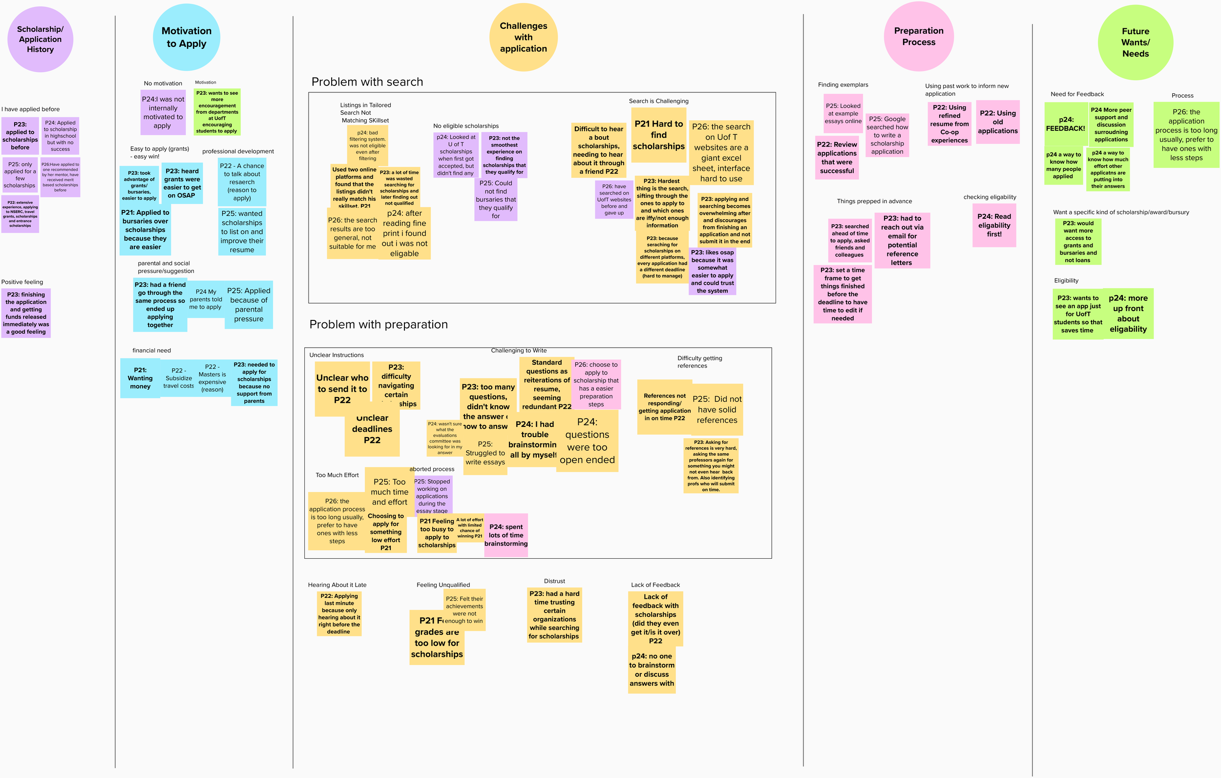
Data Analysis and Ideation
🗺 Affinity Mapping
🚗 User Journey Mapping

⚡️Brainstorming Big Ideas

To analyze the qualitative data we collected from our surveys and interviews, we transcribed the data onto stickies and grouped them into similar themes/topics.
The 5 themes we found related to…
1. Lack of motivation to apply
2. Challenges finding appropriate scholarships
3. Difficulties surrounding application preparation
4. Needs that are unmet by existing scholarship resources
5. Lessons learned from past application experiences
Using the data we collected from our user research, we mapped out our persona’s current scholarship application journey.
We split the application journey into 6 steps, and mapped out the things our persona would think, feel and do at each step.
After noticing a large emotional dip beginning at the Searching step and continuing well into the Preparing step, we decided to zero in on improving these stages of the application process.
As a team, we brainstormed our potential solutions. Here, we aimed to produce as many ideas as we could, anything was fair game.
The point of this brainstorming method was to stretch our imaginations and to acknowledge that your first couple ideas aren’t always your best.

Carving out a new path
📌 Prioritizing our Big Ideas

We then voted on the impact and feasibility of our ideas and placed them on a graph to help us identify our strongest possible solutions.
The ideas we included in our prototype were Home Runs (ideas were voted highest on impact and feasibility) and Quick Wins (ideas that were highly feasible but not quite as impactful).
Upon creating our graph, we noticed that our best ideas related to…
1. Streamlining the application preparation process
2. Making the application process less daunting
3. Improving the scholarship search experience
🔮 Envisioning a new application journey
To better visualize how our ideas would improve the UofT student scholarship application process, we mapped out a new user journey and made notes on the new things students would feel, thing and do throughout the process.

With Aquatica, students submit to multiple applications in one go – A streamlined experience
They can see past winner demographics to determine if they are the right fit – A less daunting process
Opposed to searching for scholarships, Aquatica matches students to eligible awards and bursaries – An improved search experience

Prototyping and Usability Testing
✏️ Sketching our lo-fi prototype

After sketching out screens that were necessary for key tasks, we conducted guerilla usability tests with 4 current U of T students and asked them to think-aloud as they tested our lo-fi prototype.
Issues expressed by our representative users:
“I’m struggling to find which buttons to press in order to move on to the next step”.
“There are a lot of pop-up dialogues which can be distracting”.
“Which parts of the site can I click? Which parts are meant to be graphics/visuals?”.
✅ Addressing user feedback

🖼 Building wireframes
Using Balsamiq, we created wireframes and organized them into a sequential storyboard to map out user flows of key tasks.

🚶♀️Next steps
A clickable medium-fidelity prototype was created in Balsamiq and was used to conduct a second round of usability testing. 4 UofT students were asked to click through the Aquatica prototype and complete 3 key tasks while thinking aloud.
The data collected from users demonstrated that there was still work for us to do…
Review our features and rethink the ones that weren’t as desirable for test users – Aim for quality over quantity
Consider how we would integrate Aquatica into the existing ecosystem of UofT scholarship resources
Build a high fidelity prototype and retest!
Conclusions & Lessons Learned
💨 Design solutions do not exist within a vacuum
Given that Aquatica was designed as a student resource for the University of Toronto, it was crucial for our team to learn about the existing scholarship application landscape. Taking the time to understand the space you are designing for is always time well-spent.
🗣 There is never a bad time to request user feedback
Although the features included in Aquatica were based upon user research, usability test participants were not fully satisfied with the execution of our ideas. From this experience I learned how important it is to ask users for feedback throughout the development process.